
Isometric Editorial Illustration Prompt
Tags
Advertising DesignPhotography
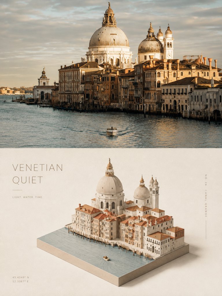
Prompt
Use each uploaded photo separately and turn each one into its own independent high-end design poster. Do not make a collage. Output one poster per photo.

Format & Layout
Create the poster in a vertical 3:4 composition.
Divide the canvas into two equal horizontal sections with a strict 1:1 height ratio:
- top half = 50%
- bottom half = 50%

Top Half — Original Photo
Keep the upper half based on the original uploaded photo.
Preserve the subject’s structure, realistic texture, natural lighting, and original color atmosphere.
Only apply subtle high-end photographic color grading so the image feels like art-magazine photography, independent publishing, or exhibition photography.
If needed, naturally extend the sky, ground, or environmental background to fit the composition, but never stretch, distort, or alter the main subject.

Bottom Half — Isometric Editorial Illustration
In the lower half, extract the most recognizable subject, silhouette, pose, and narrative relationship from the photo, and reinterpret them as a refined minimalist isometric illustration.
The illustration should feel like a miniature three-dimensional paper model, architectural maquette, or tiny display scene placed on a sheet of paper.
Do not mechanically replicate every photographic detail.
Instead, reconstruct the subject using simplified volumes, clean edges, clear layering, and distilled miniature-scene relationships.
The identity of the subject should remain immediately recognizable at a glance, while the overall illustration feels quiet, restrained, poetic, and editorial.

Visual Logic & Composition
Use an isometric-view, miniature-landscape, paper-model composition logic throughout the lower half.
The subject should feel as if it has been cut out and carefully placed onto a small paper surface or minimal base.
Keep generous negative space around it.
Use scale contrast, edge cropping, subtle shadows, and a few tiny details to create a sense of scale, solitude, and stillness.
A very small number of supporting elements may be added only if they help support the main subject, but they must never form a second visual center.

Color System
Build the entire lower-half illustration palette directly from the original photo in the upper half.
Prioritize the most distinctive, elegant, and representative colors of the subject.
Then simplify, refine, soften, and unify those colors into a limited palette.
Preserve the original image’s warm/cool relationships and overall color personality, but reduce visual noise and miscellaneous color distractions.
The final colors should feel calmer, softer, more restrained, and more like an editorial paper illustration.
Differentiate forms through tonal variation, adjacent hues, and subtle color shifts.
Do not introduce any arbitrary fixed palette unrelated to the original photo.
Render the illustration using delicate ink lines, flat color planes, gentle shadows, and a subtle paper grain texture.

Typography
Typography should be integrated subtly as part of the composition.
Extract a short English title inspired by the photo’s subject, location, action, condition, or mood.
Add only a very small amount of supporting text, such as a number, a short phrase, or a tiny annotation.
The typography should be thin, restrained, modern, and editorial.
It may align along the edge of the negative space, the subject’s base, a horizontal axis, or the isometric structure, creating a quiet and refined layout rhythm together with the image.

Overall Style
Reference minimalist isometric illustration, miniature sculptural models, paper landscapes, and high-end editorial design.
The final poster should feel quiet, poetic, restrained, refined, collectible, and design-forward.

Avoid
Avoid cartoonish styling, oversaturated contrast colors, any fixed palette unrelated to the photo, glossy plastic 3D rendering, cluttered scenes, e-commerce styling, or generic template-like poster layouts.
Share
Do the same


